100% vegan, non - toxic, and sterilized
Trusted by numerous artists
Staring at a reference image sent by a client, you notice a subtle orange-pink hue between sunset glow and ripe peach, but your kit doesn’t contain a perfect match. Do you order a special color that might be used only once, or confidently mix your basic inks on the spot like a true color alchemist?
For a true color master, a basic tattoo ink set is not the end of the palette but the beginning of all creation. Understanding how to mix and blend liberates you from preset limitations, granting infinite color freedom and a unique signature style.
Mixing color is not witchcraft; it’s a science and an art that can be learned, practiced, and mastered. Here are three simple techniques that professional tattoo artists commonly use to make every bottle of basic ink in your hand ten times more valuable.
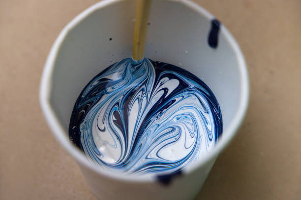
Before beginning your alchemy, you must know your basic tattoo inks like a chef knows their ingredients. This is not about memorizing chemical components but feeling them through practice.
Remember, the goal is not to mix ten colors into one, but to use three or four core colors to create an eleventh, unique color that perfectly fits your design.
Low-saturation, grayish “Morandi tones” have become highly popular in tattoos. They are soft, calm, and sophisticated. You don’t need an entire row of premade gray-pinks or gray-greens—just master one principle: use complementary colors to reduce saturation.
Principle: Colors opposite each other on the color wheel neutralize each other. Mixing them lowers vibrancy and produces beautiful gray tones.
Practical exercise: Suppose you want a “muted pink” or “gray rose.”
The bright pink gradually becomes muted, soft, and grayish. Adjust the green to achieve shades from delicate gray-pink to deep terracotta.
Other examples:
This technique instantly expands your basic palette into a full suite of stylish, story-rich intermediate tones.
When you need a lighter color, beginners often reach for diluters. But dilution can make tattoo ink transparent or cold, losing body. White and brown are smarter allies.
Essence: Lighten while maintaining volume and warmth.
Practical exercises:
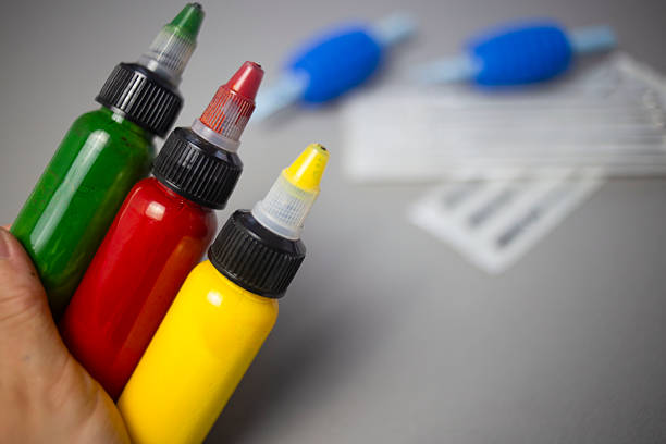
This is not a mixing-cup trick but skin magic. Complex effects (gem transparency, watercolor diffusion) require layering.
Principle: Use skin’s translucency and overlaying ink layers to produce a visual third color.
Practical exercise: A dewdrop or glass reflection effect.
Effect: Cool base + warm white overlay creates delicate color shifts and deep luminosity, far more vivid than mixing a single “blue-white” in a cup.
This requires understanding color theory and healing processes but adds astonishing depth and complexity.
Q: My colors quickly become “muddy” or dull when mixing. Why?
A: Usually two reasons: 1) Mixing too many colors at once (>3) or adding too much complementary color. Follow “minimal increments”: add one color at a time, very little. 2) Tools are not perfectly clean. Residual old colors, especially black, contaminate new mixes. Clean or replace tools frequently.
Q: Can I prepare mixed colors in advance?
A: Strongly discouraged. Mixed tattoo ink changes stability. Storage may cause pigment settling, carrier separation, or bacterial growth. For safe, consistent results, mix as you go. Treat each mix as part of the creative process; discard unused ink like disposable tools.
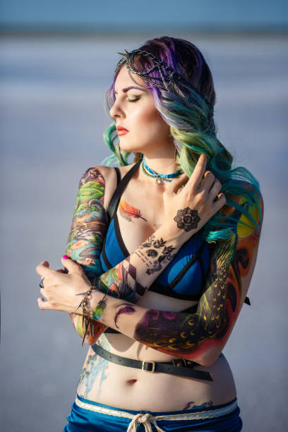
Color mixing ability distinguishes a technician from a true tattoo artist. It frees you from manufacturer color charts and allows precise translation of client visions or your own unique artistic ideas.
The foundation: a trusted, stable, and compatible tattoo ink set. A professional kit with 21 selected base colors, 30 ml per bottle, is like providing your color lab with premium, complete reagents. It encourages experimentation, supports innovation, and ensures every mix is stable and reliable.
Once you master these mixing techniques, you’ll find your creative possibilities are not limited by the number of bottles but by your imagination. From today, do not just use color—create color. Let your next tattoo carry a unique story, forged by your own hands.
Discover professional tattoo ink sets for ultimate color control
No account yet?
Create an Account