100% vegan, non - toxic, and sterilized
Trusted by numerous artists
Morning sunlight slants into the studio, dust slowly dancing in the beams. On the workbench, tattoo machines, needles, and gloves are neatly arranged, but the most eye-catching are the rows of quietly standing glass bottles—tattoo inks.
To the average person, they are just colors; to a tattoo artist, they represent a complete color universe, the strategic setup most critical before each creation.
Today, we won’t discuss client communication or sketching skills. Instead, we dive into the professional artist’s workstation to reveal how they plan and configure their tattoo ink palette like a conductor arranging a symphony.
Beginner tattoo artists see individual bottles, while seasoned artists see a system. Configuring tattoo ink is far more than “buying red, yellow, blue, green.” It is based on several core logics:
When selecting specific tattoo inks, the color name is only the ticket. What truly determines whether it becomes a reliable palette member are three key characteristics:
This is the primary condition. Will your chosen red remain the same in the bottle, on the skin, and three years later? Excellent tattoo ink exhibits outstanding color stability, resisting UV degradation and maintaining vibrancy in the skin. Color “purity” determines whether you can accurately reproduce the design, rather than ending up with a muddied or off-tone result.
Each ink you configure should behave predictably. Is its viscosity consistent? Does its diffusion in skin remain stable? Most importantly, is the formula gentle and safe enough to ensure proper healing for nearly all clients, with even color absorption and minimal risk of uneven pigmentation or excessive rejection? Consistent and safe formulations build client trust and reputation.
This distinguishes casual users from true color masters. A professional palette should allow inks to blend like musical chords. When mixing a specific intermediate color—such as a unique olive green or soft lavender—you can confidently combine existing blues, yellows, reds, and whites without chemical reactions, precipitation, or cloudiness.
This ability to seamlessly integrate with other pre-mixed washes liberates the artist’s creativity. Your palette expands from limited fixed colors to an almost infinite spectrum. You are no longer constrained by bottled colors, becoming the true creator of your color.
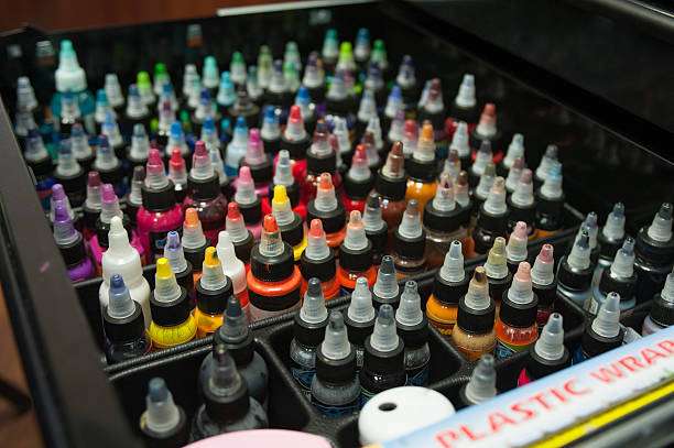
For artists building or upgrading a professional color system, a carefully curated expansion set provides a perfect foundation. Imagine a starting point: a professional ink set containing 21 carefully selected colors.
It’s not just a collection of colors but a complete color ecosystem. From deep “lining black” for skeletal outlines and “bright white” for highlights to vibrant core colors— “bright red,” “gem blue,” “lemon yellow,” “bright orange”—to natural elements like “deep brown,” “light brown,” “dragon green,” “grasshopper green,” and modern soft tones like “rose pink,” “baby blue,” “banana cream,” and special “silver.”
This setup covers foundational needs across traditional to contemporary styles. Each bottle is reliable due to stable performance and vibrant color. The true magic, however, lies in mixing compatibility—these inks blend harmoniously and work with your preferred washes, allowing you to mix any subtle shade needed, from soft vintage gradients to complex realistic shadows.
Purchasing 21 inks is essentially investing in a predictable, expandable, and reliable creative platform. It frees the artist to focus on the art itself rather than struggling with unstable materials.
Once you have a reliable palette, the next step is mastery. This includes:
A: It depends on your learning path and budget. A reputable starter set (~20 colors) has major advantages: it lets you practice a wide range of colors immediately, understand color relationships, and ensure consistent quality and compatibility. Gradual purchase suits those focusing on a specific style later. For most beginners, a quality starter set is the more efficient, comprehensive starting choice.
A: Conduct small-scale mix tests. Combine a small amount of ink with your preferred wash or another ink in a palette. A compatible combination will blend smoothly without clumping, separation, or thickening. Many professional inks mention “easily compatible with pre-mixed washes” as a sign of good compatibility. Experienced brands ensure internal compatibility across their product lines.
The tattoo artist’s palette is an extension of their artistic voice.
The process of configuring tattoo inks is a ritual merging chemical reliability, color science, and personal aesthetics. You must be both a rigorous scientist ensuring each bottle’s safety and stability and an intuitive artist anticipating color awakening on skin.
Thinking like a master about your palette means your purchase is not just bottles of ink but the foundation of countless vibrant, lasting artworks infused with your personal signature. Your palette is both your arsenal and your signature.

 Inez B. Thomas
No account yet?
Create an Account